
i
n
f
i
n
i
t
e
-
m
o
m
e
n
t
.
c
o
m
Professional Experience Summary:
Experience:
01/2023-Present
USAID
- Lead UI/UX designer
Design and develop web apps for U.S. Agency for International Development.
Software applied:Adobe Creative Suite, Adobe XD, and Figma.
Programming:JavaScript, CSS, jQuery, HTML5, and Bootstrap etc.
08/2022-12/2022
Das Rhineland Wohlt Haus
- Lead UI/UX design and development
Design and develop visual promotional products including website design and developments, banners, email letters, printing products etc.
Software applied:Adobe Creative Suite, Adobe XD, Google Web Designer, Salesforce.
Programming:JavaScript, CSS3, jQuery, HTML5, Green Socks, Bootstrap etc.
09/2021-07/2022
Brick City Green House
- Senior UI/UX developer
Design and develop for various promotional products including banners, email letters, web app etc.
Software applied:Adobe Creative Suite, Adobe XD, Google Web Designer, Salesforce, Veeva Vault, and Wordpress etc.
Programming:JavaScript, CSS3, jQuery, HTML5, Green Socks, Bootstrap etc.
05/2021-08/2021
Department of Education, G5 Program
- Lead UI/UX designer/developer
UI/UX brainstorming and recreation of G5 program for department of education by using Bootstrap, JavaScript, jQuery, HTML, CSS3.
Software applied:Adobe Creative Suite, Adobe XD
Programming:JavaScript, CSS3
03/2021-05/2021
Department of Transportation, Federal Highway Administration
- Lead UI/UX designer/developer
This project is to design and execute Highway Performance and Monitoring System which allow state DOT to file yearly statistics a by using Bootstrap, JavaScript, jQuery, HTML, XML, CSS.
Software applied: Adobe Creative Suite, Adobe XD, 3Ds max, Visual Studio
Programming: JavaScript, CSS, .net Blazor. Material UI. Teleric, API
10/2018-01/31/2021
New Direction Behavior Health
– Lead UI/UX designer Consultant
Variety of projects including design and programming Intranet and Internet by using Bootstrap, JavaScript, jQuery, HTML, XML, CSS.
Software applied: Adobe Creative Suite, Adobe XD, 3Ds max, Visual Studio
Programming: JavaScript, CSS, .net, Angular CLI
10/2018-01/31/2021
02/2016-04/2018 Consulting Business Analyst
– 02/2016-04/2018 Consulting Business Analyst
– 01/2015-01/2016 Lead UI/UI Designer
– 10/2007-12/2014 Lead Program/Analyst
Design and maintain intranet and multimedia presentation including design, flash animation, 3D modeling, Bootstrap, JavaScript, jQuery, HTML, XML, CSS and ActionScript. Apple iBooks development.
Software applied: Adobe Creative Suite, 3Ds max, Visual Studio, Sketch.
Programming: JavaScript, SQL, CSS, PHP
Software applied:Adobe Creative Suite, 3Ds max, Visual Studio, Sketch.
Programming:JavaScript, SQL, CSS, PHP
08/2004-06/2008
ESPN radio station, website designer
- Senior Web Designer (Consultant)
Design and maintain websites, multimedia, and promo advertising.
Software applied:Adobe Photoshop, Illustrator, Flash, Dreamweaver, 3D max, Soundforge
Programming:PHP, ASP, HTML, ActionScript, JavaScript, SQL, CSS
11/2005-02/2007
Sanford Brown College
- Instructor (Web Design, 3D Animation, Multimedia)
Instructor for 3D Animation, multimedia, and website design courses
Software applied:Adobe Photoshop, Illustrator, Flash, Dreamweaver, 3D max, Soundforge
Programming:PHP, ASP, HTML, ActionScript, JavaScript, SQL, CSS
08/2005-08/2008
NBC Fantasy Sports
- Senior Web Designer (Consultant)
All Start Sports /Sandbox/Rotoworl Fantasy Sports
Software applied:Adobe Photoshop, Illustrator, Flash, Dreamweaver, 3D max, Soundforge
Programming:PHP, ASP, HTML, ActionScript, JavaScript, SQL, CSS
Computer Skills:
Operating System: Windows, Apple, Windows Server
Software & Tools:
3D: Maya, 3D Studio Max, Light Wave Video Editing: Adobe Premiere, Adobe AfterEffects Sound Editing: Sound Forge, Soundbooth
Graphic: Adobe Creative suite
Desktop Publishing: Adobe Creative suite and QuarkXpress
Web & Multimedia: Adobe Creative suite
Programming: Bootstrap, ActionScript, Xcode, HTML, XML, CSS, XSL,
JavaScript, JQuery, C# .net, CMS, Understanding of JESS and SASS
Language Skills: English, Chinese, German, French
Education:
| 2000-2001 | Webster University, St. Louis, MO |
| Master of Art in Media Communication with Advertising/Marketing Emphasis | |
| 1995-1998 | Memphis College of Art, Memphis, TN |
| Bachelor of Fine Arts in Graphic Design with Illustration Major | |
| 1990-1994 | Beijing Art and Design School, Beijing, P.R. China |
| Associate of Art in Decoration Design Specialty |
Awards:
| 1998 | Graduation Portfolio Award |
| Memphis College of Art, Memphis, TN | |
| 1996-1997 | Merit Scholarship |
| Memphis College of Art, Memphis, TN | |
| 1996-1997 | Portfolio Scholarship |
| Memphis College of Art, Memphis, TN |
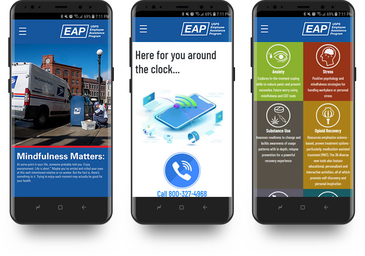
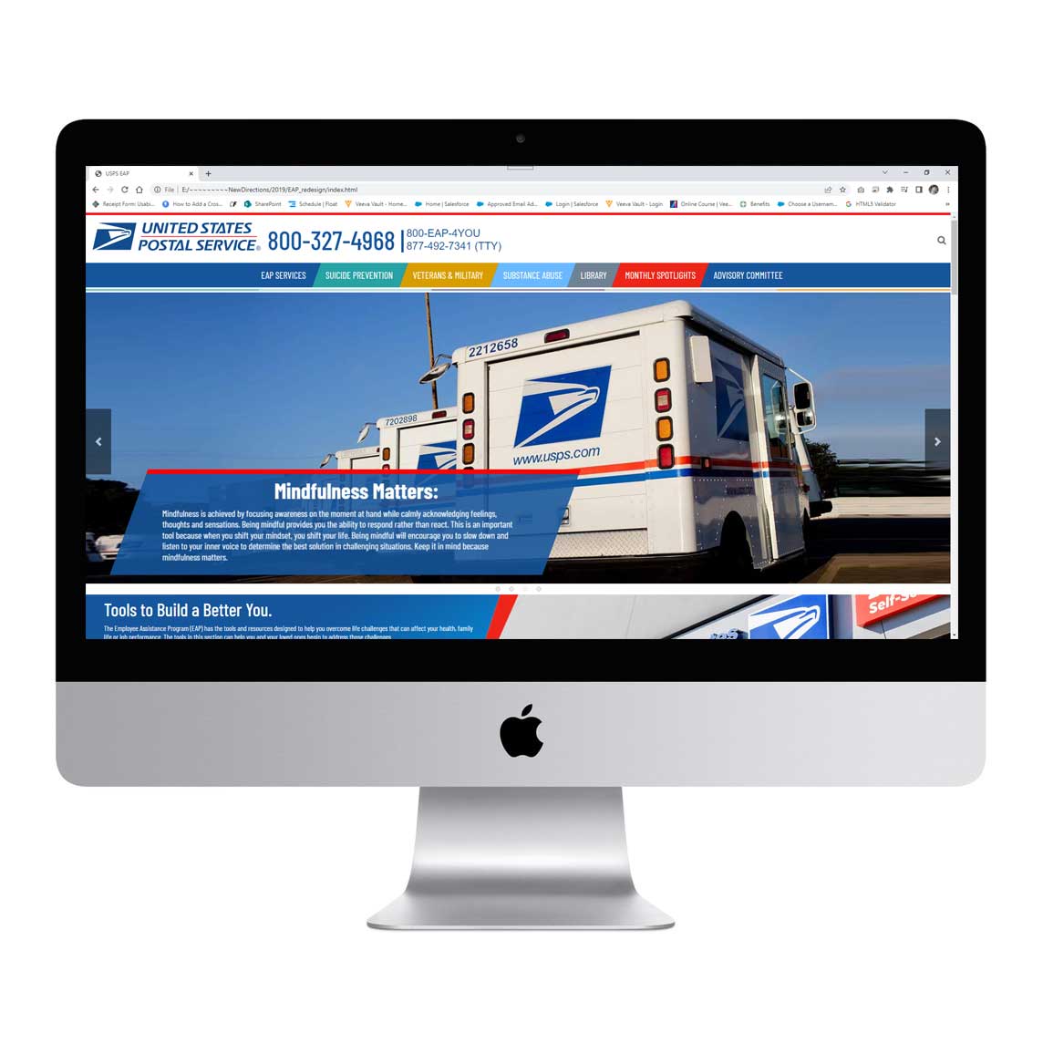
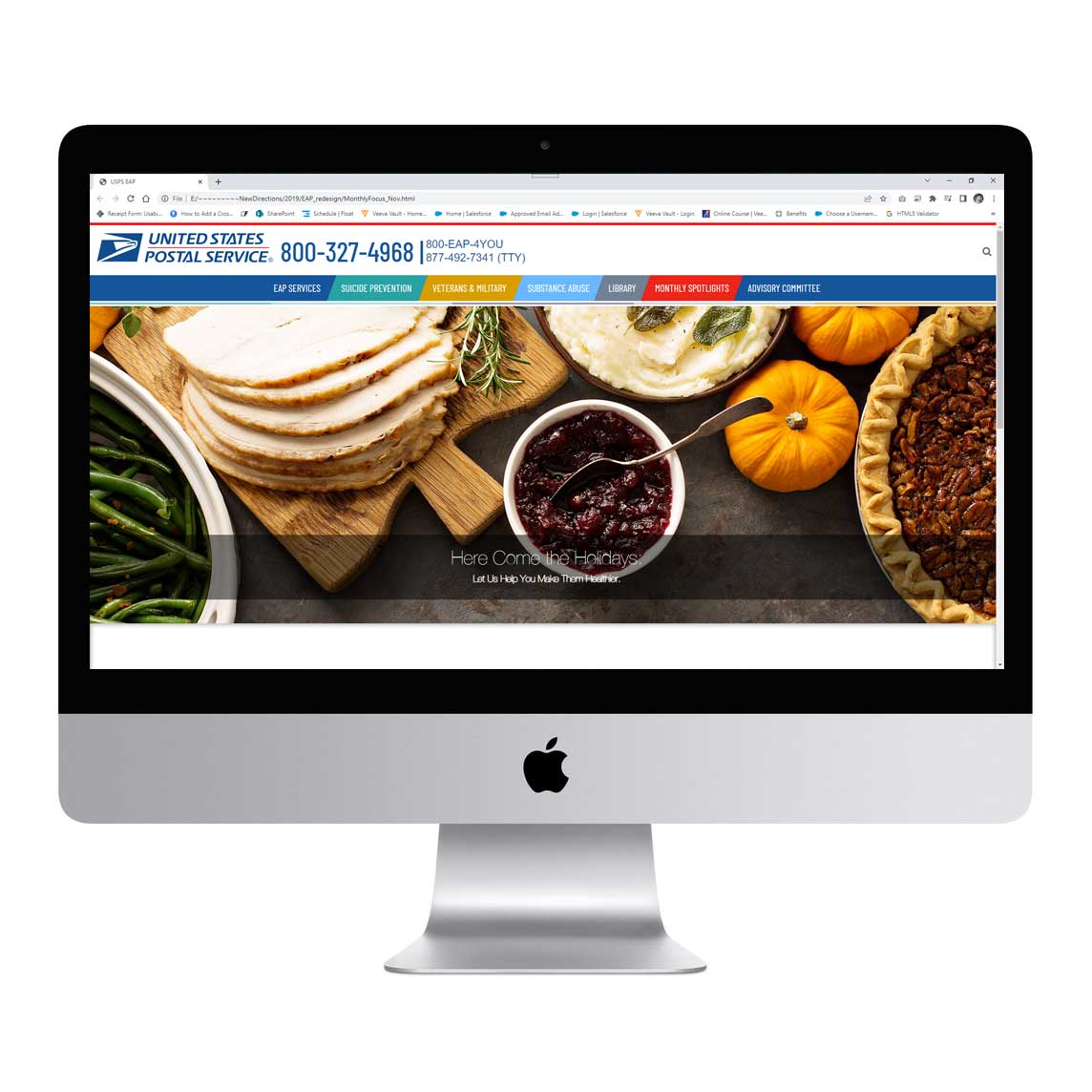
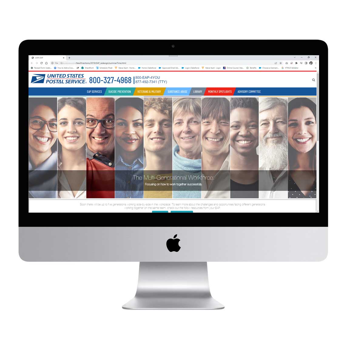
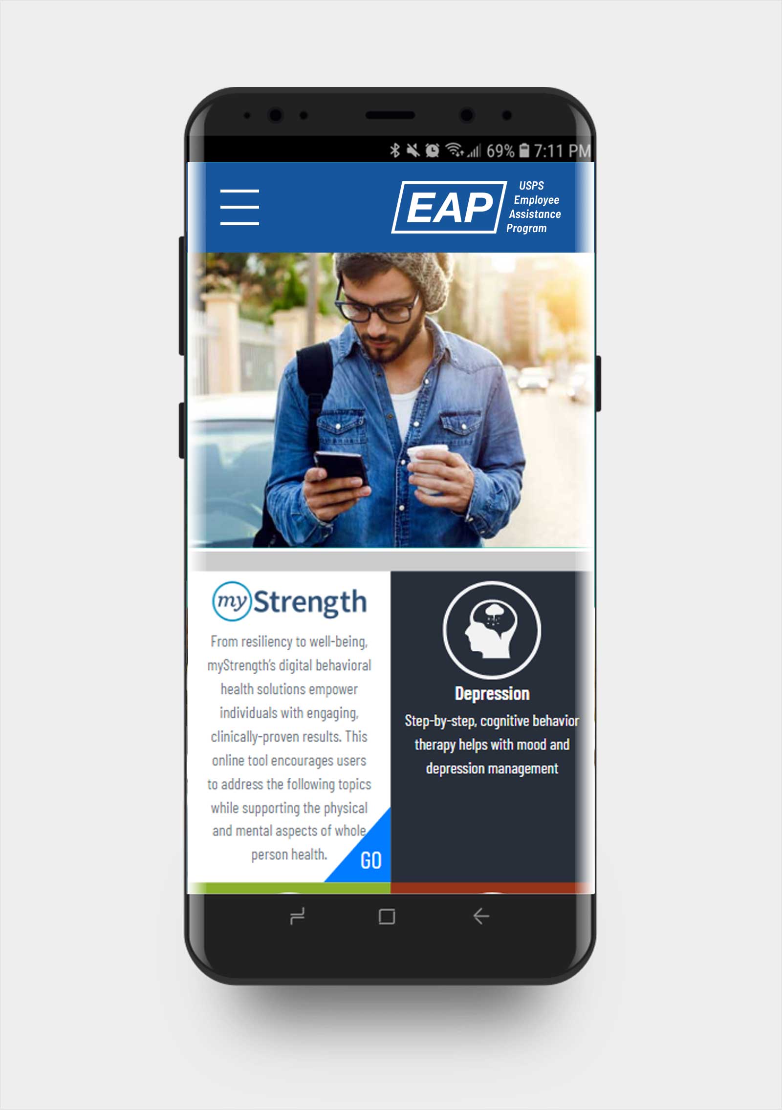
USPS EAP program provides their employees with mental health issue and offers consultation with live psychologists. The challenges we were facing are integrating all the existing programs and streamlining new products in a user centered methodology. The new products are not only providing a face lifting of previous functionalities but also design a fluid user experience work for people who are not computer or device savvy with all 508 compliances (accessbility) guidelines and mobile responsive capability.
Interviewees liked the idea of "simple and diverse". Managing services such as Opioid Rcovery or Depression should be as easy as possible. Many liked the idea of being able to see all widgets in a group, like a dashboard. Frustration and challenges are expressed as flexibility and sectional concepts.
I consulted my notes from the interviews and was able to develop the type of persona who would use the new fresh features in the EAP app. Based on my research and interviews it became clear that this group, needed help in simplify and grouping features. "Myeonhe" and "Kesha" are based on the people I spoke to and the struggles the fluidity of existing app. They were 2 of the interviewees to help bring that struggle to light and make the journey to groupling more relatable. Here, we really begin to get a sense of who they are.
There are three task flows : One for a user to create a new goal, another for modifying an existing goal, and finally one where the user could easily access once the feature was set up. A task flow demonstrates the beginning to end walk through the process with no deviations. View the full task flow.
Here is where I got to get into my persona and really look at what a real user might decide to do along the path to creating their goals. There are many decision points to consider, like are they creating a new goal or modifying one that already exists. They also needs to take into consideration how the goal will be funded. The user flow is like a task flow but takes decision points into consideration, which may take the users into other directions along the flow. View the full user flow.
I used both my task flow and user flow to start sketching some low-fi wireframes. This sketch represents the creation of a new goal with a second step of editing the goal once it's created. Getting the ideas rapidly down on paper really helped to solidify the flow. I find this method the best way for getting ideas down quickly and being able to iterate on them just as quickly. View the full sketch.
Once I got the low-fi sketches to where I wanted them, I began creating the high-fidelity wireframe/prototype inside of Adobe XD. Here, is where the UI starts to come together and I was careful to stay within the parameters of the already established branding of the USPS app. I wanted to be sure I stuck to the original task of making sure the new tool embedded well and smoothly with the rest of the app. Interact with the prototype. I also used HTML, Bootstrap, jQuery to create a dynamic version of interactive prototype which could be used in futher development stage. By doing this step, I could load the work in BrowserStack for repsonsive testing and accessbility testing in Level Access. This step is critical for refine the prototype work but also make the whole process seamlessly be transferred to UI development.
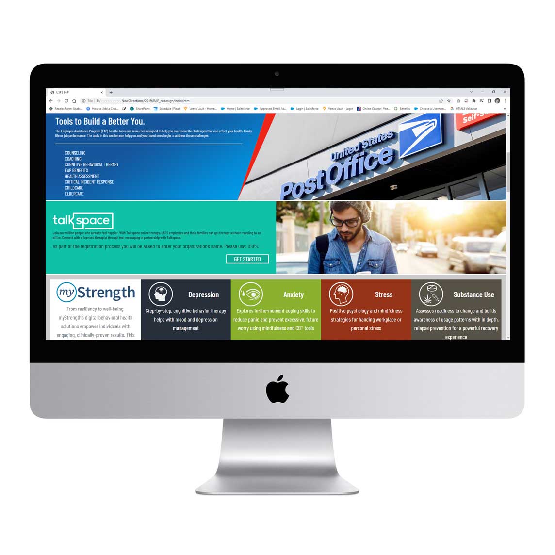
From the affinity map I was able to pin point a couple of distinct patterns. There were some users who had difficulty with a few of the elements on the Suicide Prevention screen. There was also clearly some confusion around the My Strenghth Screen and the fact that the Get Started button seemed grayed out to people. Between the patterns that emerged and users' suggestions, I was able to prioritize which changes I needed to make. In this case, making sure the Suicide Prevention screen can be more easily understood takes priority because that page was impeding people from moving forward. View the affinity map.
I determined that most of the suggestions for change that came from users and the patterns found in the affinity map were simple enough to implement. Had there been a significant amount of changes that needed to take place, I would have used a priority matrix to pin point exactly which changes were low effort/high impact and implement them.
 Logo Design
 CI Design
 Web Design
 Poster Design
 UX/UI
UX/UI